Try LinkedIn — Covers with safe zone, headline and About section, PDF carousel and posts now, no sign-up needed

LinkedIn — Covers with safe zone, headline and About section, PDF carousel and posts · Banners, headline, carousel and posts: what decides whether they buy from you
For people who sell their services on LinkedIn, not for people looking for a job. Here you prepare the banner strip that actually shows, the headline and the "About" section counted character by character, the carousel as a PDF and the posts with the hook in the first two lines. It doesn't connect to your account, doesn't publish for you and doesn't read anyone's profile: you copy and paste.
In the features that use AI, responses are generated by artificial intelligence and are not a substitute for professional advice.

컴퓨터에서는 완벽해 보이던 표지를 올렸더니, 모바일에서는 잘리고 프로필 사진이 중요한 부분을 가리나요?
모바일과 데스크톱에서 표지가 다르게 잘리고, 거기에 프로필 사진이 각각 다른 모서리를 가리기 때문이에요. 실제로 보이는 영역은 좁은 띠 하나뿐인데, 그 위치를 알려 주는 곳은 없어요. 이 앱은 그 영역을 그려서 두 가지 크롭에 시뮬레이션해 보여 줘요. 프로필 사진 원도 실제 위치에 맞춰 표시하며, 아무것도 생성하기 전에 확인할 수 있어요. 나머지도 마찬가지예요. 헤드라인과 ‘소개’는 실제 자소 단위로 제한에 맞춰 세고, ‘더 보기’ 줄은 실제로 잘리는 위치에 표시해요. 캐러셀은 플랫폼이 보여 주는 형식인 실제 PDF로 나오고, 게시물에는 펼치기 전에 읽히는 부분을 위한 대안 훅 두 가지가 들어 있어요. 각 이미지의 문구는 이미지 모델이 아니라 서버가 쓰기 때문에 글자가 일그러진 표지가 나오지 않아요.
See the tools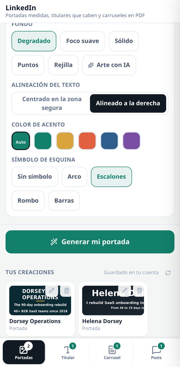
Discover every feature in detail

LinkedIn Cover 1584×396: safe zone and measured contrast
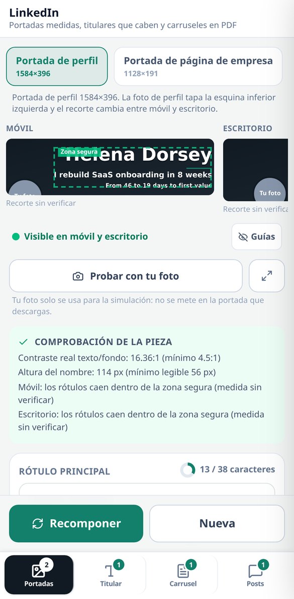
Create your LinkedIn profile cover at 1584×396 px with the safe zone of 1010×258 outlined, the label composed on the server, and the contrast measured on the final image (threshold 4.5:1). Five backgrounds without AI and free to start.
Try it free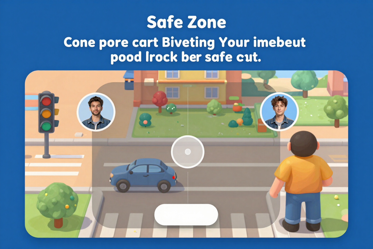
LinkedIn Cover Simulator: how it looks on mobile and desktop
View your LinkedIn cover on both cuts at the same time, to the same scale, with the profile picture circle in its real position and the safe zone marked. Three-state traffic light and button to center. Free and no registration.
Try it free
LinkedIn Company Page Cover: 1128×191 and safe area
Create your LinkedIn company page cover at 1128×191 px with the logo space deducted, the safe area of 780×140 drawn, and the contrast measured on the final image. Simulation on mobile and desktop, five backgrounds without AI, and free to start.
Try it free
LinkedIn Headline Generator: formulas and a 220-character counter
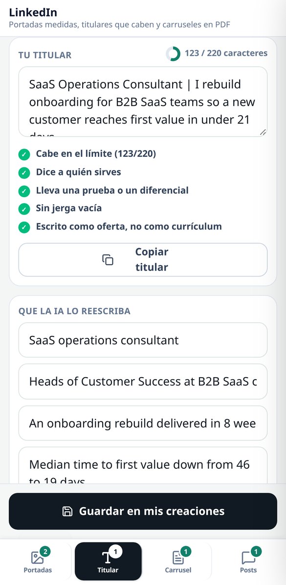
Create your LinkedIn headline with five fillable formulas, a character counter that counts emojis as 1, and five checks (audience, test, jargon, tone). Free, no registration, and no AI spending.
Try it free
'About' for LinkedIn: block template and 'see more' cut-off
Write your LinkedIn 'About' in five blocks with its own counter, structure validator, and the 'see more' line drawn where it actually cuts off (the first two lines or 275 characters). Free, no registration, and no AI usage.
Try it free
Create LinkedIn carousel in PDF: 1080×1080 or 1080×1350, from 5 to 12 pages
Generate the LinkedIn carousel as a real PDF document: cover, 3 to 10 numbered slides, and closing, in 1:1 (1080×1080) or 4:5 (1080×1350). The text is adjusted by measuring each box, and the PDF is verified by counting its pages before delivery.
Try it free
Hooks for LinkedIn posts: two alternatives and the 'see more' cut at 210 characters
Write your LinkedIn post in five formats and receive TWO alternative hooks for the first two lines, with the 'see more' cut drawn over the editable text. Characters counted by graphemes and a filter that eliminates interaction bait and notifies you.
Try it freeFour tools, and the AI doesn't set the measurements
각 이미지 작업물의 텍스트는 서버가 구성하고, 대비는 완성된 캔버스에서 측정해요. 시뮬레이션, 글자 수 세기, 검증, 다시 구성, 레이아웃처럼 규칙에 따라 정해지는 작업은 즉시 처리되고 AI를 쓰지 않으며, 상당수는 계정 없이도 쓸 수 있어요.
Banners: the strip that's visible, simulated before you generate
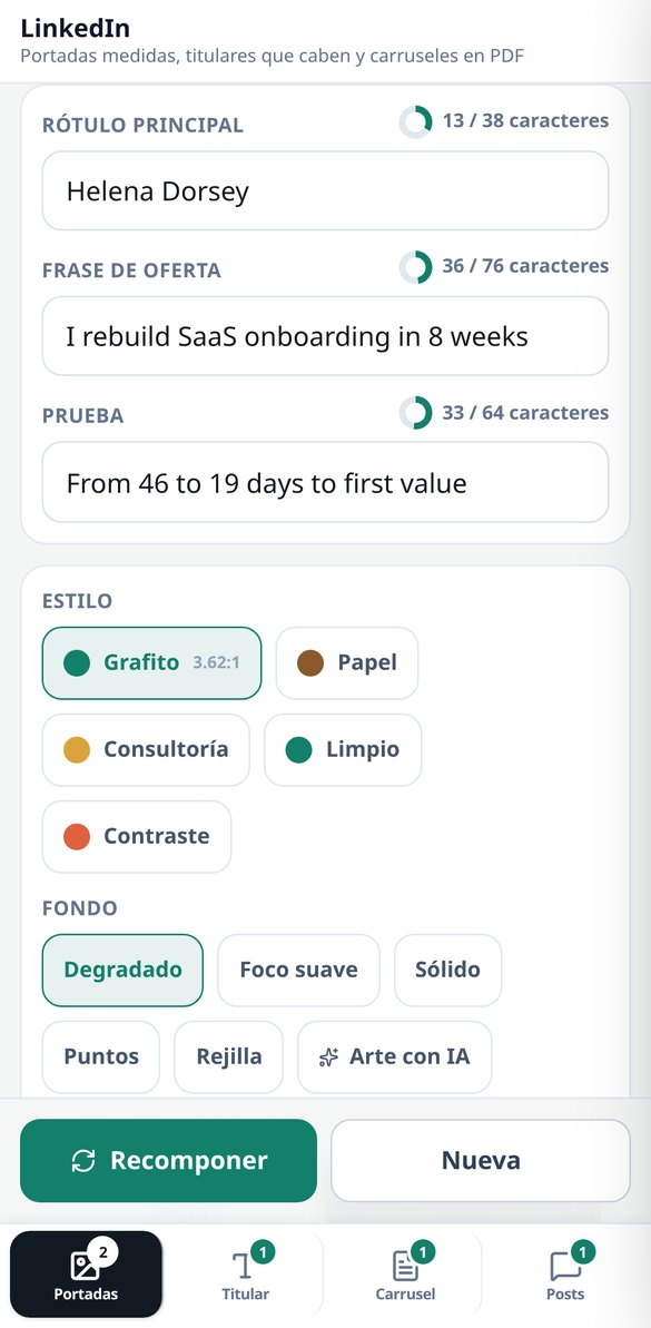
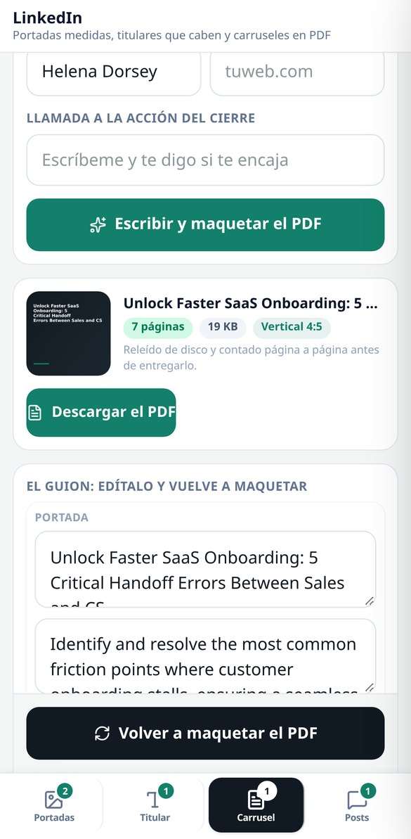
The 3 profile assets with their dimensions: profile banner 1584×396, company page banner 1128×191 and featured image 1200×627. Each one is drawn in its 2 crops (mobile and desktop, at the same scale) with the safe area marked and the profile photo circle overlaid, so you see what's going to get lost before you spend anything. 5 styles, 5 server-composed backgrounds — linear gradient, radial gradient, solid, dots and grid —, 2 alignments and 4 pictograms; with those backgrounds the asset comes out with zero AI calls. The label is written by sharp by measuring the real ink box, and if it doesn't fit even at the minimum legible size, the app tells you how many characters are over instead of shrinking it until it can't be read. The contrast in the safe area is measured for real (WCAG luminance on the already-composed image, threshold 4.5:1) and, if it falls short, a veil is applied and it's measured again. Changing style, accent, alignment or labels recomposes without paying for the art again. The photo you upload is only used in the simulation: the file you download comes out clean.
Headline and "About": counted for real, free and with no sign-up
Real grapheme counter with Intl.Segmenter — one composed emoji counts as 1 — against the catalogue's limits: 220 in the headline and 2,600 in "About", with the "see more" line drawn at 275 characters, which is where it cuts. 5 curated headline formulas with fill-in-the-blank slots, an "About" skeleton in 5 blocks (hook, who you serve, how you work, proof and call to action) and a validator with 5 checks on each piece, including 23 jargon terms and a warning when you're writing like a candidate instead of like an offer. All of that happens in your browser: not a single network request, no sign-up, no cost. If you want the rewrite, a single AI call gives you 3 headlines, the "About" section in blocks and up to 3 job descriptions rewritten in terms of service, and the server validates them with the same counter before handing them over.

Carousel as a PDF and posts with a hook, no engagement bait
The carousel is delivered as a real PDF — the native document format — in 1:1 (1080×1080) or 4:5 (1080×1350), with a cover, 3 to 10 body slides and a closing slide, over 4 script structures. The body is fitted by measuring the text with the document itself, not with heuristics, so it doesn't overflow; and before handing it over, the app downloads the file again, checks the %PDF- header and counts the pages with pdf-lib: if it doesn't match, it pulls it. It comes with a server-composed PNG thumbnail, and re-editing the script and laying it out again doesn't cost another AI call. For posts: 5 formats, 2 alternative hooks for the first two lines with the "see more" cut drawn live, 3 suggested contribution comments and 4 tones. Engagement bait ("comment YES and I'll send it to you") is stripped even if the model writes it, and the app tells you it's been removed.
From idea to asset in three steps
회원가입 없이 바로 써 보세요
브라우저에서 바로 열려요. 글자 수 세기, 공식, 검증, 표지 이중 시뮬레이션, 서버가 만드는 배경은 계정 없이 게스트로도 사용할 수 있어요.
생성하기 전에 작업물부터 확인하세요
표지에서는 안전 영역과 그 위에 겹친 프로필 사진이 있는 두 가지 크롭을 볼 수 있어요. 헤드라인과 ‘소개’에서는 글자 수와 ‘더 보기’ 줄을 볼 수 있어요. 비용을 쓰기 전인 이 단계에서 고치면 돼요.
다운로드한 뒤 직접 붙여 넣으세요
표지 PNG와 캐러셀 PDF를 다운로드할 수 있어요(모바일에서는 기본 공유 시트로 공유해요). 텍스트는 복사하면 돼요. 앱은 계정에 접속하지 않고 대신 게시하지도 않아요.
Frequently Asked Questions
Latest blog articles
Guides and news to get more out of it
LinkedIn downgrades posts that sound like AI: what it considers 'generic content' and how to write without losing reach
LinkedIn downgrades generic posts with classifiers at 94% accuracy since October 2026. What reveals an empty post and how to write without losing reach.

Why Your Reach on LinkedIn Decreased in 2026 (and What the Algorithm is Looking at Now)
On November 9, 2026, LinkedIn detailed its Profile Relevance model: matching each post with the reader's profile. Data on the decline, formats that retain, and what to change.
Get your profile ready before you upload another cut-off banner
두 가지 크롭을 시뮬레이션하고, 글자 수를 정확히 세고, 작업물을 다운로드하세요. 회원가입 없이 시작할 수 있어요.